Menu Template:
Orange Navigation Bar Menu |  |  |  |  |
Shiny Button Creator
This menu is generated by Flash Menu Builder.
Create your own menu now!
Or follow on Twitter :Web Buttons , Web Buttons Shiny Button Creator

Shiny Button Creator Screenshots

Menu, Button, and Icon Collection
Flash Menu Builder provides huge collection of 1400 web buttons, 6600 icons, 300 ready-made samples, so you'll create really nice looking menus and buttons with little or no design skills at all! Web 2.0, Mac, iPhone, Aqua buttons, Vista, XP, transparent, round, glossy, metallic, 3d, tab menus, drop down menus will be a breeze!Button and Icon Samples

How to Use Flash Menu Builder Menu Generator
1) File menu
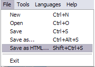
New - to create new project.
Open - to open saved project. You will be asked if you would like to save the current project in the menu buttons creator.
Save - to save current project in the project file (*.xwb). When you save to project file, the directory "ProjectName.xwb.icons" is created, where ProjectName is the name of your project file. This directory contains button icons, .css and .js files of the saved menu.
Save as… - to save current project in the project file (*.xwb) or in the HTML file or to save your project under another name. Choose type from the "File type" list in the "Save as…" dialog and enter project's (new) name. When you save to project file, the directory "ProjectName.xwb.icons" is created, where ProjectName is the name of your project file. This directory contains button icons, .css and .js files of the saved menu. If the menu doesn't have any icons then the directory is not created.
Save as HTML - to save current project into the HTML file (*.html). Project HTML file will be saved then, and the directory created, containing buttons' images. The directory name will be: "YourProjectName-files", where YourProjectName is the name of the HTML file saved. For example: if you enter "Header" in the "Name" field of the "Save as…" dialog, then "Header.html" and directory named "Header-files" will be created.
Exit - to close Vista Buttons application.
2) Tools
Export images - to save menu buttons' images as gif-files (*.gif), png-files (*.png) or jpg-files (*.jpg). "Save As…" dialog will appear, where you can either type each button name or leave it unchanged. If you want to save the button images, press "Save". "Save settings" dialog will appear where you can choose image format. Either way (if you don't want the button images to be saved), press "Cancel". This procedure will be repeated for all the menu buttons. When you press "Save", 1 to 3 images are to be saved, depending on the menu type. Their names will be: ButtonName_0.gif - ButtonName_2.gif, where ButtonName is the name you have entered when saving.
- ButtonName_0 - corresponds to Normal state.
- ButtonName_1 - Hot state image.
- ButtonName_2 - corresponds to pressed/clicked state.
Theme editor - to edit/create new themes.
Page insert - you can insert your menu into the existing HTML page.3) Languages menu

The "Languages" menu contains the list of available interface languages. English is the default language setting.
4) Help menu

Help - to read the help.
About -show information about Vista Buttons.- Double click on the one of the predefined buttons' and submenus templates to apply it to your menu When the submenu is larger than the visible area of the page the submenu will be automatically decreased. You can use scrollbar to see all submenu items Build menus completely based on Cascading Style Sheets. It is possible to appoint the individual CSS styles for separate elements of the menu.

Save project. Save your image buttons as html
You can save current project in the project file (*.xwb) or into the HTML file (*.html).
Javascript Horizontal Menu Bar
Padding and Spacing
Specify various values for padding and spacing for the whole menu and for each separate submenu.
Hacer Menu Con Xml
Export graphic picture
Using Vista Buttons you can save menu graphic picture as gif-files (*.gif).
Css Picture Based Vertical Menu
Image Navigation
Use images for icons, backgrounds of items. Using images you can create menus entirely based on graphics.
Menu Xml Desplegable
Support
Please contact Customer Support at (please include template name in the message title)
FAQ
- ".. Is there a way to add images to the image collection of the button software?
- "..Can I set the pressed state of a javascript Vista Buttons after the page loads?" Web Pages Unique Menu
- "..Can I set the pressed state of a javascript Vista Buttons after the page loads?"
- "..How can I set up Vista Buttons dreamweaver extension?"
- ".. Can site buttons be added to my existing web pages and how easy is it to update once it is installed and do? "
- ".. Is there a way to add images to the image collection of the button software?


